
Last time
we started to view various territorial brandings, successful as a rule. At that
time it was logos of Las Vegas and Melbourne Perm ,
Kazan cities and some countries such as Croatia , Estonia ,
France , Italy and Slovenia
New-York
The process
of the New-York branding started in 80s and today we can say that its
territorial branding is one of the most serious in XX century. City branding
became an important strategy which has already proved its efficiency. In 1977
the New-York Commerce Department gave an order to Wells Rich Green agency to do
an advertising campaign. Nobody knew that campaign will take longer than it was
planned. Designer Milton Gleizer made a city logotype absolutely gratis.
Suddenly it became the New York

This city
is an example of how large-scale cultural and sport events can promote the
branding starting. In fact this method proves its value: the city is in the
centre of the events, all media watch it intently and all advantages and
disadvantages are conspicuous. New Kazan

Well-known
and one of the most expensive Russian designers offered a quite simple logotype
for Perm Perm
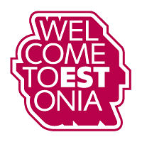
Desire to
become the European Union member made Estonia ESTonia


Rebranding
here was in 2006. I can’t say that restyling changed the composition a lot,
rather the presentation style was transformed. New logo has more bright colours
and sun cheer mood. The symbol became more attractive and pleasant visually,
and doesn’t resemble those corporative red-blue colours more.

In contrast
to the Croatian logo the Slovenian one underwent important changes. Besides the
new type appeared it was worked out new image including three symbols: a lime
leaf, a heart and the Slovenian mountain Triglav. But it was quite difficult
for amateurs to identify all these symbols. Rather they make the logo like
flame that correlates with the country branding in a strange way. And used
colour decisions make it too dark and not such cheerful.

Italian
logo had considerable changes. Old sign was rather dynamic in its composition
and had a riot of colour. Traditional Italian flag colours are used in new
logotype; it became more accurate and even ascetic but rich in meaning at the
same time. Symbol supports the country motto “Italia leaves trace”
by Valentin
Ivanov
Or join us on Facebook and Linkedin
No comments:
Post a Comment